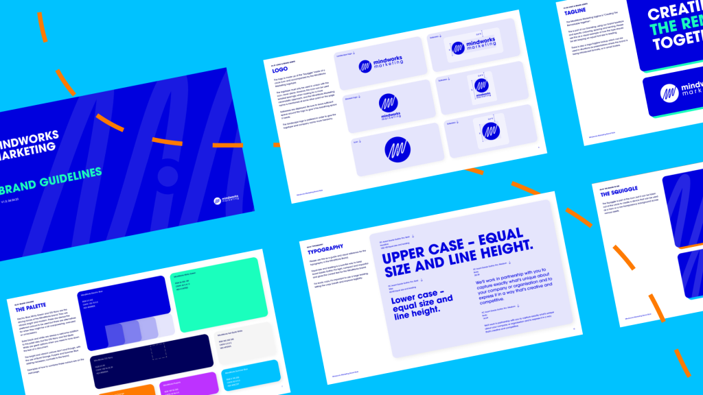
Brand guidelines are the rulebook for your brand’s identity. From the colour palette and typography to your tone of voice and imagery choices, they encompass everything your brand is about. Get them wrong and it leads to a disconnect between the image you want to convey and how it’s perceived by your audience. Get them right and they define what you are all about before a word of your message or even your brand name is read (eg Nike swoosh).
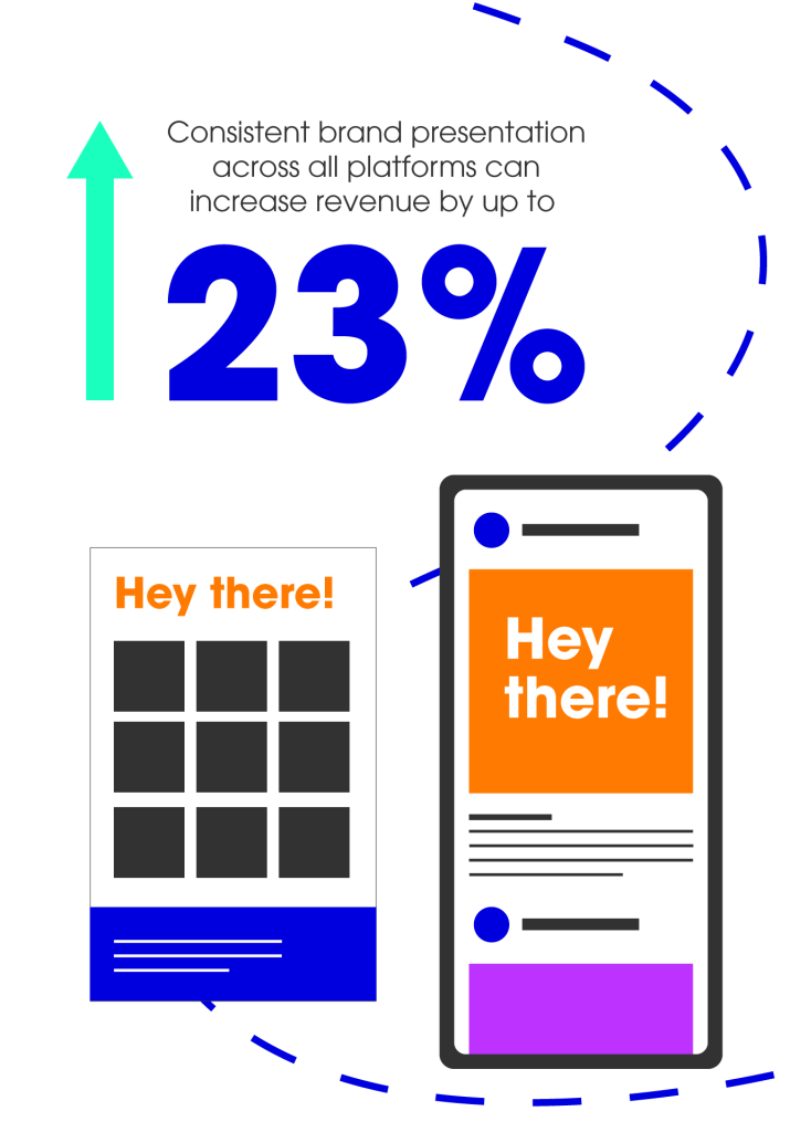
For start-ups and small businesses, creating a strong visual identity is crucial for gaining traction and strengthening brand recall. A set of brand guidelines will build a cohesive image from the ground up, covering every external and internal facing digital and print asset. The key here is consistency. According to a Lucidpress study, consistent brand presentation across all platforms can increase revenue by up to 23%.
Then there’s the money-saving aspect. By eliminating guesswork and reducing the need for extensive revisions, your agency’s designers, marketing content writers and social media pros can get work out of the door quickly (at less cost to you).

Colour: the subliminal message
Colours are psychological triggers – every choice sends a subconscious message to consumers. Blue for corporate brands like IBM denotes trust and professionalism, the red of Coca-Cola creates a sense of urgency, driving impulse purchases. The Mastercard logo is so recognised by customers that it just consists of their 2 brand colours. The stickiest brands consistently use defined colour combinations for every piece of visual content.
Talking typography
The typography used reflects your brand too. A bold and minimalist typeface will convey contemporary and innovative, while a classic serif font feels more traditional and authoritative. Choosing a font that is scalable across various platforms and devices, compatible with web and mobile interfaces, as well as print ads, packaging and marketing collateral, keeps it consistent and reinforces your brand. Clear legible fonts also make sure you adhere to the latest accessibility guidelines.
Write on point
An editorial style guide streamlines processes and makes sure everyone is aligned on brand messaging and standards. It functions as a reference tool for written content, including social media, blogs, PR, ads and promotional collateral to ensure consistency in voice, tone, format, grammar and language usage.

The cost-saving secret
Having a set of brand guidelines to go by eliminates guesswork, reduces the need for extensive revisions and ultimately means that our design team, marketing content writers and social media pros get work out of the door quickly (at less cost to you).
Brand guidelines come in any size – they don’t have to be a 100-page document. It might just consist of a main and back-up typeface, your chosen imagery, logo types, primary and secondary colours for print in CMYK (Cyan, Magenta, Yellow and Key (black)) and for digital in RGB (Red, Green, Blue) and Hex codes.
We provide all our clients with a shortened guidelines document for free as part of their project or we can also create a full set of brand guidelines as a separate project. Want to talk about new brand guidelines or thinking of refining your existing ones?


